Dinkus has to be one of the best words I’ve learnt in my PWE course. A dinkus is a line of asterisks or a small symbol that marks a section break in published work. Typically they’re used for scene or point of view changes, and they’re a great alternative to cutting a chapter short.
Three or four asterisks ( * * * ) is the traditional dinkus, but lately (especially in YA) many authors have been creating or designing their own dinkus for their book. I’ve created four dinkuses (dinki? dinkies?) for three novels, not only because it adds character to the page but also because they’re a great marketing strategy. I want my future readers getting these designs as tattoos, I want them embossed in gold on the spine of my book, I want them made into stickers and temporary tattoos and bookmarks.
Now, I’m no artist. In fact, I’m pretty lousy at sketching and shading. But the simplicity of a dinkus takes all that away. The first dinkus I ever created is simple and effective: it’s just two swords and an arrow crossed to form an ‘A’. Using my (secret PowerPoint) graphic design skills and some Creative Commons images, this is the result.
 And I love it! It’s the symbol for the Autumn guild, and tattooed behind the ear of Autumn guild members in my novel Frozen in Flame.
Where there is the Autumn guild, there is their opposite, the Scorpion guild. This one took several drafts. At one stage it was a metal whip with a scorpion tail end, but I could never get the proportions right. The result is slightly classier than originally intended, which works since the new leader of the Scorpion guild is the Fire Prince.
 This one is my favourite, I must admit. It goes on the back of the neck of a Scorpion member and is used in chapters from the Fire Prince’s point of view.
The next one is a little boring, but effective and to the point. Follow the Tracks is set on a train line, so:
 Super simple PowerPoint creation. Adobe over-complicates things.
My current work in progress, Lady of Light, has had two dinkuses. Often I draw a story’s dinkus while I’m writing (as I handwrite everything) so sometimes it’s difficult to translate to a digital form. But in the end, I like the final product more than the original!

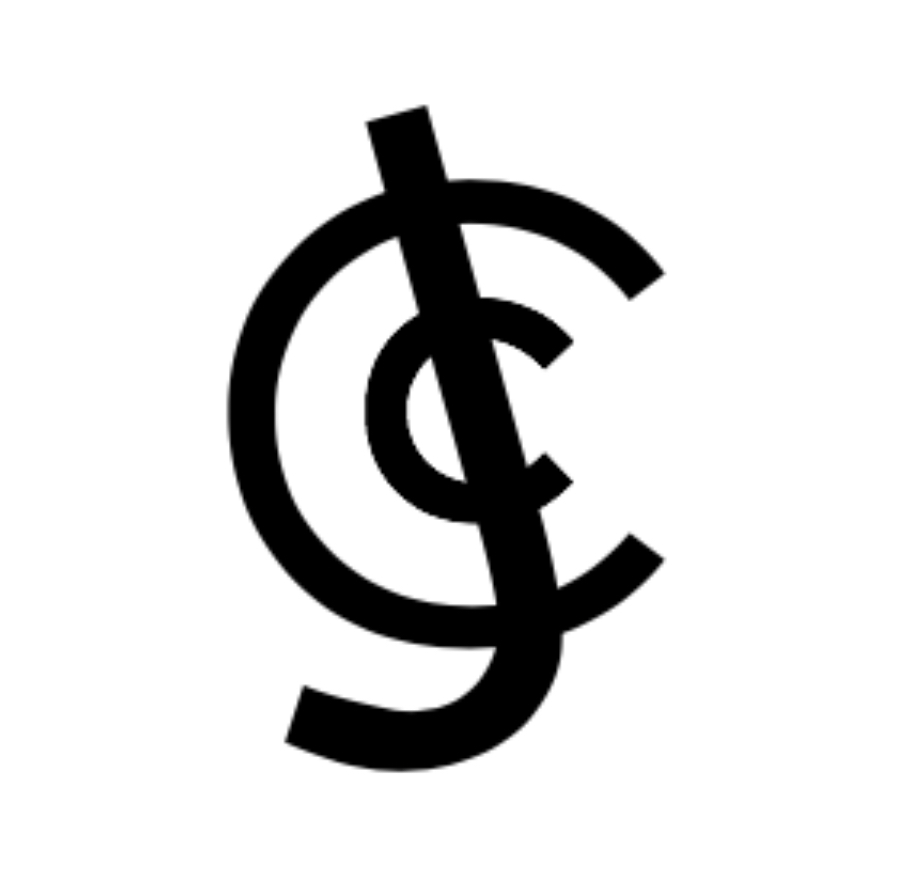
Last but not least is a symbol that isn’t actually a dinkus. I created this symbol years ago, first as a sailor soldier symbol (I was young and obsessed), and second as a Japanese hanko stamp. It acts as both a signature and a brand. It’s been through some very rough drafts but I’ve been using the final product for some time now (you should recognise it if you’re reading this!).
 When I began creating my author profile, I knew I wanted this to be a part of my brand. Sadly it’s sometimes confused for a football symbol!
As a sign off, here are some draft dinkuses and novel-related drawings that haven’t yet made it to the digital stage. Forgive my atrocious sketching!
One: an attempt at the union of ice and fire for the end of Frozen in Flame.
Two: draft tattoo design for the Betrothed in Lady of Light.
Three: draft company logo for the Neoxena Corporation in Living With The End Of The World.
Four: Neoxena corp’s logo used as a dinkus.


